


We are surprisingly used to seeing ancient Greek temples and statues in monochrome. Slick, stylish beige marble and limestone give them a certain “antique” aesthetic and look good in instagram.
However, in reality ancient Greeks would’ve been flabbergasted to see their exquisite artworks in such a plain state. No red? No blue?
Boulder-dash.
Pun intended.
To put a pause to this monochrome lobby, I dived deep into the ancient Greek colour-code system and studied the ways they added life to monumental constructions and statues.
Apparently, Greeks were not strangers to adding some “rave” to the “routine.”
Technically, the Greeks recognised four “root” colours - white, black, red and yellow. Aristotle even links those four to the elements. But we’ll cover a few more hues, just to be sure.
White (or λευκὸν)
The simplest to achieve: leave the marble bare or apply lead-white or a fine stucco over limestone. Unsurprisingly, white symbolised purity, the divine and daylight.
White was widely used on column shafts, architraves and as an under-tone for flesh on statues.
Blue (κύανος / γλαυκός)
A tad more expensive colour, logically linked to sky and sea - the realms of Zeus and Poseidon. Because Egyptian blue was hard to produce in quantity, this noble hue was reserved for Doric triglyphs, meander bands, helmet crests and deep irises.
Oh, yes, the statues had eyes.
Red (ἐρυθρός / φοῖνιξ)
Made from red ochre or cinnabar, red was a “transitional” colour - perfect for coming-of-age cloaks, bridal veils and, of course, blood. Hence its use in metope backgrounds, on lips and cheeks, and on warriors’ cloaks.
Yellow / Gold (ξανθός / χρυσός)
Its meaning hasn’t changed much. Sunlight, glory, prosperity blah-blah-blah.
Yellow highlighted hair, torches and garment borders. Gold leaf did the same for prestige pieces.
Green (χλωρός)
Achieved by smashing malachite or conichalcite to dust, this colour was associated with nature. And nature means fertility, renewal. Green could’ve been found in foliage on pediments, and on garment patterns.
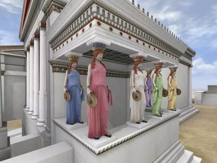
Purple (πορφύρα)
Purple has long been the colour of royalty. Complex to produce, Tyrian-purple dye cost a fortune. If your coin purse was full, you might afford a touch of purple on robes or cult statues.
Nothing is too expensive when it comes to the gods, right?
Black (μέλας)
Dark pigments symbolised mourning. However, black served another important function. A bit of dark pigment on the sides could create visual depth.
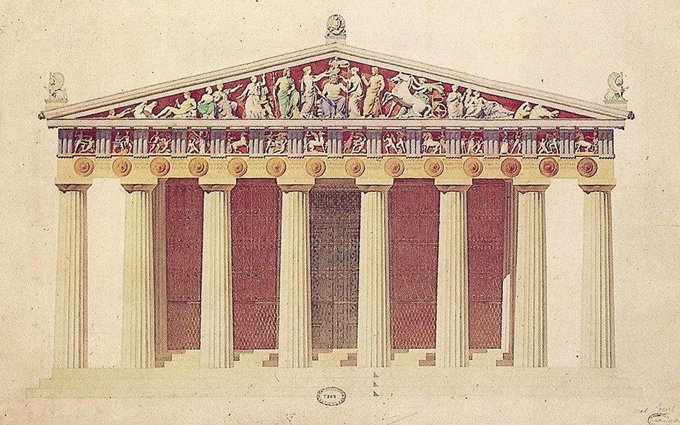
If we look at a Doric temple, it had a specific colouring system.
A Doric exterior followed an almost diagrammatic code:
White ‐ crepidoma, shafts, main architrave
Blue ‐ every triglyph
Red ‐ every metope background and many taenia mouldings
Black ‐ deep recesses for contrast
This alternating blue-and-red rhythm made the frieze legible from ground level while leaving structural members visually “light.” And here’s the main difference between colourful temple and a monochrome one.
Colour adds another level of perception.
When it’s all white - we see the construction as a monolith. Although initially the intention was to create a building to last forever, adding colour proposed a very different image. Besides, other orders had different colour coding, separating one temple from another.
Before we jump to conclusions, one small favour to ask.
So, colour was not cosmetic.
It was information architecture.
It separated architectural orders at a glance.
It amplified narrative reliefs that were otherwise several meters above eye-level.
It broadcasted political messages - swap a blue-eyed Athena for a red-cloaked Ares and the entire pediment tells a new story.
And just like that you know that the Ancient Greeks preferred colourful expression to stiff monochrome minimalistic canva-appropriate design.
This was so interesting and easy to read! Thank you